
We have changed! A disclaimer right at the start: nothing has changed in terms of our services, our culture and our excellent software products.
Why have we refreshed our corporate design?
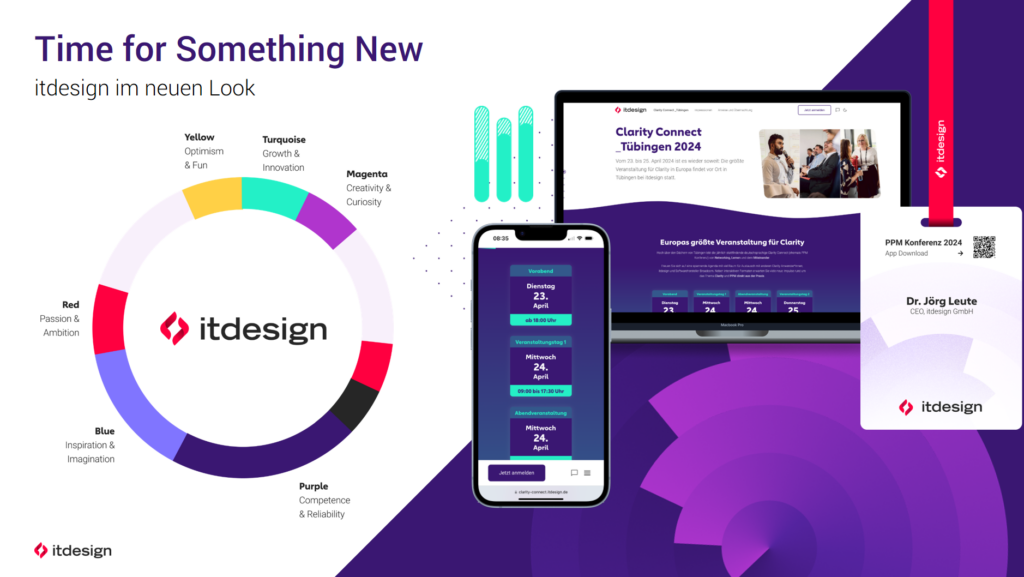
We want to be more colorful! There are also very practical reasons for this: We want to enrich infographics, illustrations and graphic decorative elements with a greater color spectrum. That’s why we need new, bright colors!
The second reason is that itdesign radiates the values we stand for to the outside world. We are warmhearted and ambitious, we have fun at work. In addition, there are other attributes that are inherent to our brand, such as competence, optimism and creativity. All of this is reflected in our new colors.
And what’s behind the new logo?
With our corporate design refresh, we have also given our logo an update. The text mark has been made clearer and the striking pictogram is intended to make our logo more expressive and recognizable. The pictorial elements are based on a code symbol </>, because we are a software company after all. The bright red and rounded shapes give the rather technical bracket a warm, human side. You can also see two hands shaking. Or two talking mouths.
What’s next?
As always, we are pragmatic: our new CD will be rolled out gradually – so don’t be surprised if you still see websites or business cards with the old logo on them in the coming weeks or months. By the end of 2024, itdesign will be completely redesigned.
Read Next
Julia Schreiber
Leiterin Unternehmenskommunikation

Julia leitet die Unternehmenskommunikation bei itdesign. Sie hält, was ihr Nachname verspricht: Für itdesign schreibt sie Social Media-Beiträge, Pressemeldungen und verantwortet das Sponsoring und ...

“Best Employers in Baden-Württemberg” Award Goes to Tübingen
Great Place to Work Institute Award: itdesign is among Germany's best employers.
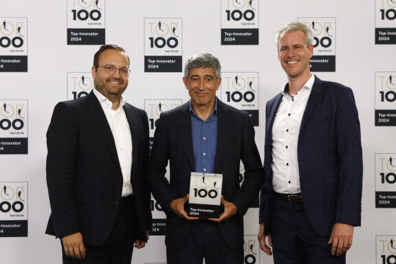
TOP 100 Award: Ranga Yogeshwar honors itdesign for innovative achievements
itdesign is one of the "TOP 100" most innovative SMEs: science journalist Ranga Yogeshwar congratulates itdesign GmbH on its award.